One of the most important things for every developer is their setup. How you have your computer environment set up will determine how fast and efficiently you can code. Spend some time here to make sure everything works well. If it doesn't, don't hesitate to reach out.
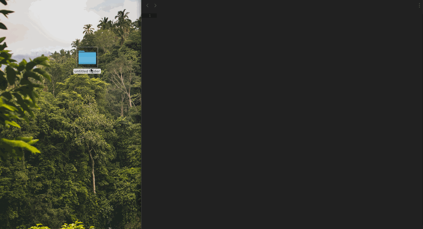
Create a folder in your Desktop screen called
Develop(her)[or whetever else your heart desires].Open Sublime Text Editor. Once you do, a black screen should show up
Drag the folder you just created onto your Sublime Text Editor. This should activate a new left panel with your folder inside.
Give your folder a right click and create a new document. This should be called
index.html. This is where a lot of the magic will happen. ✨Once a new page opens to the right, write
index.htmland hitcmd + sor in the navbar on top you should see a tab calledFile > Save as...
Now we will build the structure of our site; the skeleton. You can see each <tag> as the building block of your site, the layout of your house. Based on how you structure these, the rest of the design will follow. This means, be careful. Draw it first on a paper page with each tag so you know where everything goes.
We will start by writing HTML in your
index.htmlfile.This should look something like this:
Loading..
Once you finish coding your main structure, then you can start adding values to your tags.
Add in some funky emojis by tapping
cmd + ctrl + spacein your Mac orWin + ;on Windows. 🤪🥑🧠Add in some cute icons to your webpage to make it more lively. You can search for nice free here or here.
Add images to some more images about your hobbies to your page. In order to do that:
Create a new
imagesfolder, the same way we created a file, except now we will select the Create a New folder button on our left hand navigator.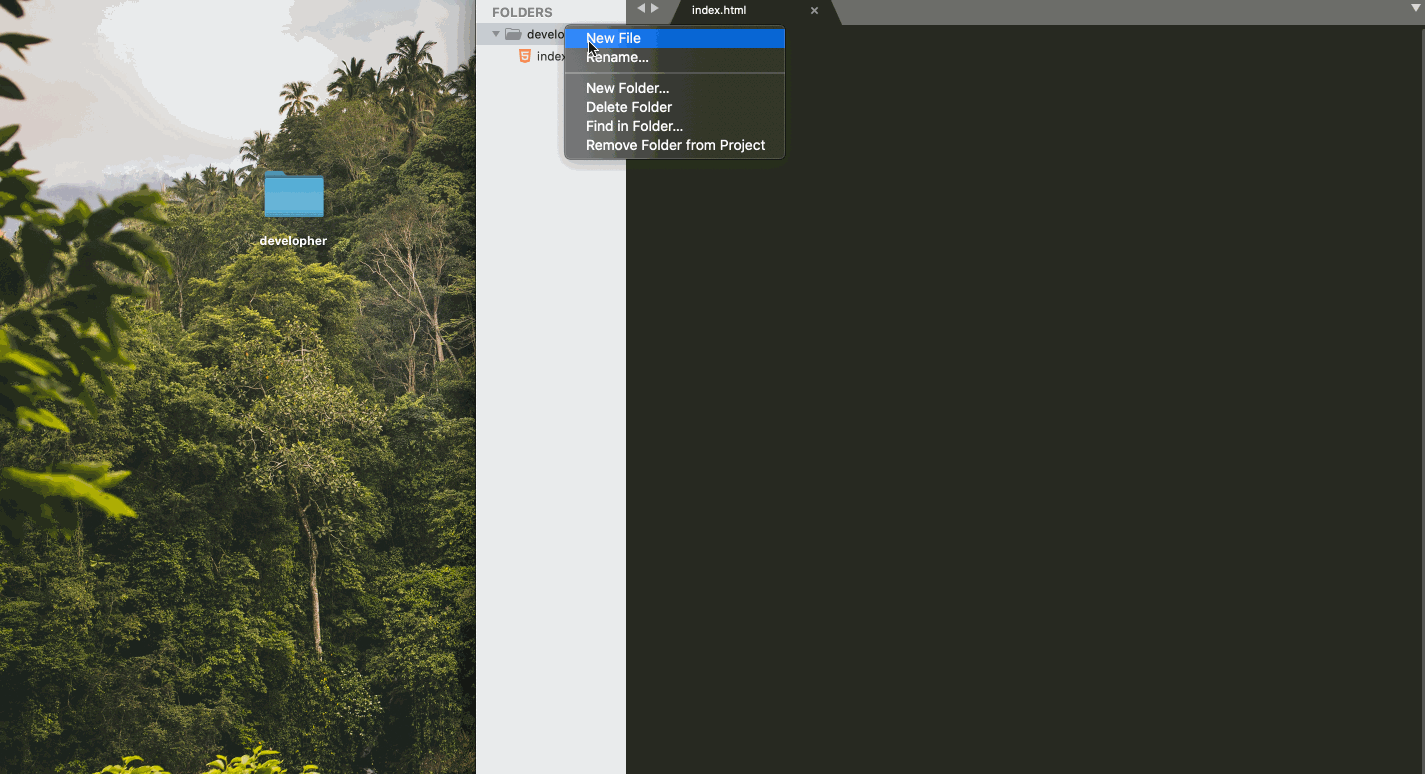
Then, store the images you want to use in your page in this
imagesfolder.Once you have them, call them throughout the your page by using your
imagetag like we did in the code below.
Add gifs to brighten someone's day. Everyone loves a moving image.
If you want to save some time, you could just grab some of mine.
Otherwise, head over to Giphy and get some.
Once you find the one you want, save it in your
imagesfolder so you can use it throughout your page.You can repeat the steps provided to add an image. Surprisingly, a gif is added the same way we add an image, through the
imgtag.


First, link your
style.cssfile inside theheadtag of yourindex.html.Then, use the CSS code below to give you a head start on adding some color and fun to your page.
Make it your own 🤪:
Get some cool fonts at Google Fonts
Need some inspo on font pairing? Font Pair may help you on that department.
In terms of colors and color palettes, you may find some nice coloring schemes here: Coolors or Color Hunt
Also - here's a cheatsheet in case you were wondering all you can do with CSS!
Loading..
PS - remember that in order for those fonts to work, you need to link them in your index.html's head. To do this, you can just copy the embed link Google Fonts gives you.
Loading..
Flexbox
The first thing we need to do is activate Flexbox on the
divwhere you want to use it. Remember the one receiving this are its flex items.This is done by adding
display: flexto the element whrapping all items you want to be affected.For example, in our website we'll add Flexbox to our hobbies so that they're right next to the other. In this case, we'll add
display: flexto theulsince we want eachlito act as the flex items.Loading..
Once you have the container set and activated, the default behavior of Flexbox is to make your flex-items inlined, so you should already have them displayed horizontally. Nice work! 👏🏼
Next step now is to make sure this is not only inline, but also displayed with some nice space in between each image.
In order to do this, we're going to add
justify-content: space-betweento our.flexclass. This will make sure that all flex-items are displayed with space between them based on the size of the element where it lives.This is really nice because the space between them is calculated automatically, without us having to worry about the specifics.
Loading..
Now, let's say we add in 3 more cards to our hobbies list.
Loading..
What we shall see is that the cards are now falling outside of the
divwhich is of course not the behavior that we want.We can solve this with
flex-wrap: wrap.Flex-wrap will make sure your flex-items are wrapped inside the container
divso that they can't fall outside of the box.Loading..
The rest is up to you ✨. Have fun exploring different types of layouts to your page. Maybe a square? Maybe have them be different sizes with the flex-grow property? Find all the flexbox hacks here and even a few fun games to get started if all of this is too confusing still 😛🐸.
Flexbox Defense
Game to get better using Flexbox by repositioning a frog within its pond.
Flexbox Froggy
Fun game where your job is to stop the incoming enemies from getting past your defenses using Flexbox to stop them.
Media Queries
Often times, you will sadly find out that the mobile behavior is not exactly what you want. Sadly this happens more often than we want to. 😔
However, there are some good tips to help improve this behavior:
Write your widths, heights, margins and paddings with percentages rather than fixed pixels when possible. This makes sure things are proportional depending on the device.
Use tools like Flexbox, CSS Grid or Bootstrap grid whenever possible to make sure this responsive behavior is handled for you.
Use media queries to make sure you're getting the behavior you want when your screen is a certain size.
Media queries make sure that whenever the screen of the user is 640px, for example, the design is displayed in a certain style, different than when it is displayed in a computer screen or a tablet.
In order to use them, the first thing you should do is google the screen size of the device you want to adapt your page for. The search can be something like media queries for (device you want)
Here's an easy resource to checkout if you don't know where to start.
Now that you know what the screen size, we can start adding the breakpoints and adapting your design as you wish.
Here's an example to get some ideas flowing, you know that you can change everything about your design and it will get added when the screen crosses that given breakpoint. Go wild 🤪
Loading..
The best way to grasp programming concepts is by practicing and studying the default behavior of the language.
For this section, rather than building upon our own site, I will share some outside resources where you can practice what we learned today.
- Learn JavaScript: This is one of my personal favorite resources to learn. It's well-structured, clearly explained, and with lots of practical examples and challenges. Highly recommended.
- FreeCodeCamp game building: Free CodeCamp is a nice resource of articles and recollection of challenges for people learning to code. Specifically this resource is a cool tutorial where you learn JavaScript by building 7 games.
- CodeCademy - Learn JS: Learn programming fundamentals and basic object-oriented concepts using the latest JavaScript syntax. The concepts covered in these lessons lay the foundation for using JavaScript in any environment.
6 - WEB ANIMATIONS
Creating events in the DOM (Document Object Model) is how we animate our sites so that they feel interactive for our users.
Before we get to the animation section though, lets create another file in our folder called index.js. This is where we will write our JavaScript. We can do this by following the same steps we used to create our index.html file in the first section of the course.
Once we have the file, this is still not enough. We need to make sure our HTML file can read the JavaScript file. In order to do this, we will add the file to our index.html file, somewhat similar to what we did with our style.css.The difference is that rather than placing it at the head of our file, we will place it as the last element before closing the body. This guarantees that the whole HTML document is loaded before the JavaScript is set up on the screen, which enhances the site's user experience.
Loading..
In order to do that, we will follow 4 steps to make our animations. There are other ways to do this -- and this is usually where the JavaScript frameworks become really powerful -- but this is a nice way to get you into thinking of what you can do when animating your site.
Select the element 🔤: This is the part where we select the specific element we want to animate.
This can be done by using the same CSS selectors we use for adding the style to our elements.
Loading..
Hire the Event Listener 👂🏽: the Event Listener is the watchman we hire to look over our app. Its job is merely to be on the lookout in case the event it's looking out for actually gets triggered.
Loading..
Now, be advised. At this point, your Event Listener still won't work. We just hired her, but we haven't given her a mission yet.
Define the mission 🧐: This is the section where we tell the Event Listener which event it should be looking out for.
Whenever we're defining the mission, we're always going to give it two parameters:
The DOM Events, which can be a mouse event, a key event, a touch event, etc..
The animation or change that shall occur when the event happens.
Loading..
This should still fail because we haven't defined what
animationis, so let's define it and actually create the animation!Create the animation 💥: This is where we give life to element we have selected. When we're building our animations, this will always be in at least 2 steps:
Select the element we want to animate.
Now this is important: Be careful not to confuse the element for the event and the element for the animation.
The element for the event is the element the event will be happening on, aka the element (
paragraphin this case) the Event Listening is looking out for when the user clicks.We also have the element the animation is happening to. Now, usuuuuually these two elements will be the same. "When the user clicks on paragraph, the paragraph should be the one to change its color, size, etc. BUT this is not always the case.
Sometimes, I want to make sure that when the paragraph is clicked, the image underneath changes height, or the background color of the document is changed.
Once you have the element selected, now we want to perform the animation on it.
The best way to understand this is by checking out the Inspector console on the browser and play with all the properties we can apply to an HTML object.
As you can see from the video, all the properties in blue are all the things we are able to do with our elements.
Of course, this might feel overwhelming at first with so many options. This is normal. My best recommendation is to just play with it and see what you can do.
Here are some examples:
Loading..
- RESOURCES
We will be using several resources throughout the workshops. Here you shall find an updated list with the cool tools we used that day + some extra fun challenges for you to checkout at home.
- Workshop Presentation Slides: In case there's something you want to look over again.
- HTML Cheat Sheet: Nice resources to check out all the possible HTML tags you have at your disposal and have a read through their default behavior.
- CSS Cheat Sheet: CSS resource to check out the properties you can use to design your web page with CSS and their explanations by MDN - Mozilla, creators of Firefox. (they have some of my favorite front-end web documentation out there)
- CSS Interactive: Website that allows you to see live the reactions to your CSS code. Believe me, this can come in handy as your start elaborating in more complex features.
- Bootstrap Cheat Sheet: Resource to see all Bootstrap classes on a single screen and spot their behaviour. Becomes really helpful when you know what effect you want, but are not sure whether this can be done with Bootstrap in an easier way.
- FontPair: Helps a lot when finding matching typographies. Font Pair basically gets major fonts found in Google Fonts and pairs them up with a nice seconday font, making it easier for you to select your site's typography.
- CSS Gradients: Gradient generator for CSS. Surprisingly these are not as easy to do as one might think. That's the cool thing about learning to code: you start appreciating the websites when they're cool.
- Cool Backgrounds: Website that allows you to create CSS gradients, but with texture. Yeah 🤘🏼
- Box Shadow Generator: Box-shadow generator to give your components some perspective and angle.
- Best Practices for Single Page Websites: Article about the best practices to make a single page website.
- Flexbox Cheatsheet: Cheatsheet helping you to better understand Flexbox and its behavior.
- A guide to Flexbox: Not a cheatsheet per se, but a more in depth explanation of all the possible properties we can pass to our flex containers and flex items.
- Flexbox Froggy: Game to get better using Flexbox by repositioning a frog within its pond.
- Flexbox Defense: Fun game where your job is to stop the incoming enemies from getting past your defenses using Flexbox to stop them.
- Guide to Media Queries: In depth explanation about how media queries work.
- DOM Events: Here you can find a list of all the DOM events you can pass to Event Listeners to look out for.